Neocities.org

WOOOOO i officially have 2.5 pages of my website working and looking exactly how i want them to on desktop . Im very excited and proud. I need to work on the oc page a little more especially bc Dori and Val are giving me Positioning Issues(I might just cut up the backgrounds and put a layer for the wall that sits in on the zindex in front of dori)(i also need to fix the shading on her)

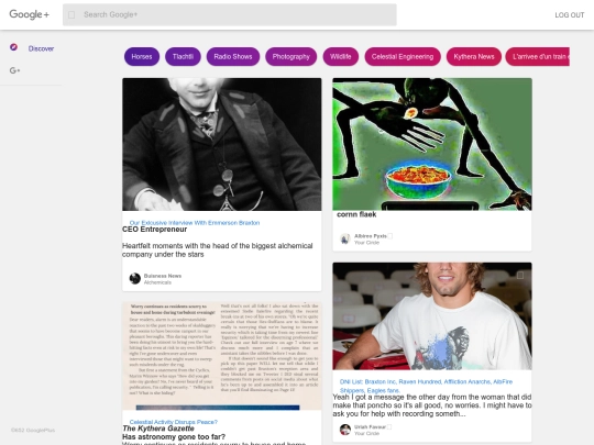



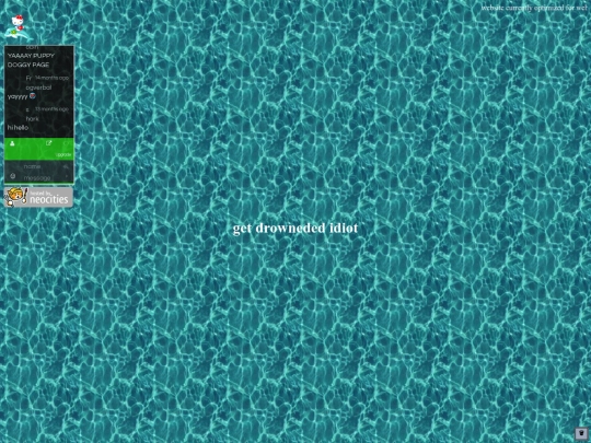





I'm proudest of the oc page sofar tho. my fucking guys <3 My next steps are to be working on the ttrpg tree and the links page. Also the link images for billy's landing page. Which i also need to make the bgs on that vectors instead of pngs
Also! While it doesn't look amazing on mobile it DOES work. I need to do an acessibilty test on the pages i do have working though
Accessibilty test results: index page is mostly accessibly, one image is missing an alt text. IMO i need to do better alt texts on everything there anyway. Oc landing page needs better text colors and all images need alt text. Expected this. The placeholder text has bad contrast but its placeholder. ttrpg landing page has same problems as index. I'm really suprised wave marks pretty accessible? But happy!
accessibilty issues on the finished&mostly finished pages fixed :D it's so funny bc like. the first version i was doing was using a template and was signifigantly less acessible but here's my goofy gimmicky one and its more useable lol