Neocities.org

1 like
1 like
1 like
1 like
1 like
I have not seen if you have a guestbook, but thanks for checking mine out! As for the marquee, I actually have two separate ones running. The stamps on the sidebar are just a tag, it's old but it works.
 shadowfae
2 years ago
The poetry header is pure CSS, the stamps didn't like that one so I didn't do it there, but it's pretty simple. {animation:floatText 20s infinite linear; white-space:nowrap; position:relative; right: 100%;}}. I added some javascript to randomize the text content, but that's all there is to it. AntiKrist also has a few marquees you can study, if mine doesn't work copy/pasted in!
 shadowfae
2 years ago
Hard agree though, Neocities is just. So many systems. :p Can't wait to see how your site progresses!
 shadowfae
2 years ago
Just noticed neocities hates me. It's a marquee tag with the html brackets. Hm.
 hearthplace
2 years ago
thank you! should just be tooling around for the next while, trying to figure out what we want to do with the place.
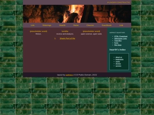

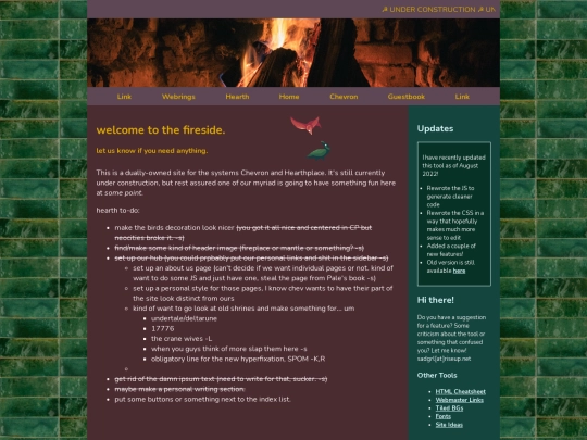

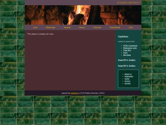
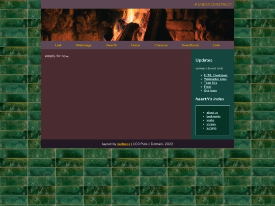
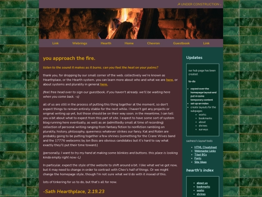
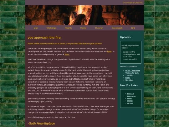


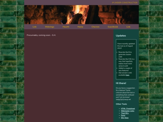


Oh! I don't actually have Just One page, I stole the idea from antikrist and Key's Klubhouse- it's a collection of iframes! Just open the links in a new tab and you'll see how the pages are actually formatted.
It works well if you want to actually splice layouts, like how shrines usually deviate from the main site's layout and have their own, you just link it normally and don't link it into the iframe. As for header images, I recommend unsplash, it's where I was looking for mine. :O Best of luck!
oh, i gotcha! thank you!