Neocities.org

I went out on the currently weekly walk, and captured a single photograph of interest.
2 likes
2 likes
This is the only source of real documentation regarding actual usage of XeTeX without LaTeX that I have come upon. Thank you.
3 likes
I've now noticed your page dedicated to Susan Kare. Some weeks ago, I fell in love with Bigelow and Holmes's vectorization of her 'Chigago' bitmap typeface. It feels perfect for user interfaces. https://en.wikipedia.org/wiki/Chicago_(typeface)#/media/File:Chicago_typeface_spec.svg
3 likes
2 likes
I decided that the text justification afforded by CSS alone is harder to read than setting the text ragged, and so the text is now set ragged.
3 likes
 kaa
1 year ago
The section regarding font selection has had some additions, and now features an emphasis on finding one or two good typefaces to stick to.
2 likes
 kaa
1 year ago
Some quotations have been appended to the section of miscellany, featuring Chuck Bigelow, Kris Holmes, and Donald Knuth.
2 likes
2 likes
2 likes
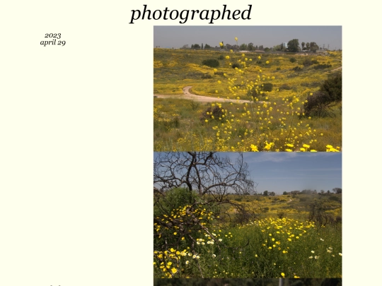
As has become a habit, I went out on a walk, and took a couple photos that I feel are worth sharing.
3 likes
3 likes
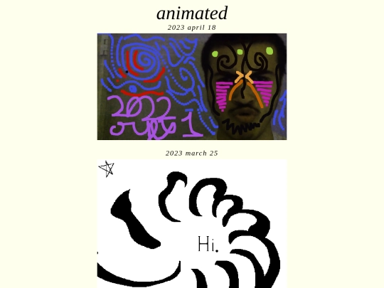
I had drawn a psuedo-animation over the course of some months, and have now shared it. It is particularly flashy in nature, and perhaps was a poor use of time.
1 like
 kaa
1 year ago
I was recommended to turn down the framerate. Rather than 24 frames per second, the video is now at 6. It no longer hurts to watch.
1 like
 kaa
1 year ago
A photograph initially too dark to view has been carefully remastered from the raw capture, and has now been shared.
1 like
2 likes
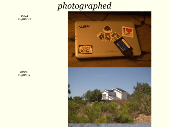




After some internal back-and-forth, I've added a second photograph below the first.
Today, I did some music composition, and have now shared the result.