Neocities.org

my fiance made my button look 8000x better with their photoshop magicks!!! THANK YOU! https://whiona.me/links/ might wanna update my button if you are using the old, hideously fuzzy one that i made myself lol....
5 likes
Love all the slowpoke :D
2 likes
1 like
Thanks for the follow! I read those Caligula docs...it sounds interesting. I'll have to add it to my list of games to check out.
1 like
 dhampirave
1 year ago
OMG THANK YOU I DIDNT THINK ANYONE WOULD ACTUALLY READ THEM,,, soon enough i want to make a page dedicated to the series (and if i do those docs will be moved there) but i still need to make some more updates before hand! ill add your button soon
1 like
 whiona
1 year ago
I love Vocaloid and JRPGs so it sounds like something that would definitely be up my alley!! Cool, I'll add your button too when I push my next update :>
1 like
Added lotsa stuff! The games page is finished and if you go to the OCs page you can visit the minisite I'm working on for my FFXIV WOL (basically just moving her lore and screenshots off of carrd)
2 likes
i continue saying words on the internet https://whiona.me/blog/2023/09-25-followup/
9 likes
1 like
Your site is SO PURPLE! Love it!
1 like
1 like
Hey, thanks all for your really thoughtful and encouraging responses to my first blog post. I really had no inkling that so many people would read it. I'm writing a follow-up post right now with some additional thoughts and a very basic Semantic HTML tutorial that is totally newbie-friendly. Semantic HTML takes very little effort and will greatly improve your site's accessibility!!
5 likes
i just read your blog post about mobile accessibility. it's very interesting to hear about it from someone who relies on a phone for day-to-day web usage. admittedly i haven't paid much attention to how easy to use my site is on mobile until relatively recently but it's something very important to me. glad to know there are people who can benefit from the measures i take to make my site easy to browse on mobile :]
2 likes
 whiona
1 year ago
Thank you for taking the time to read and comment! I honestly never paid mobile sites much mind either before I got sick. There's a lot of things you don't think about until life forces you to!
1 like

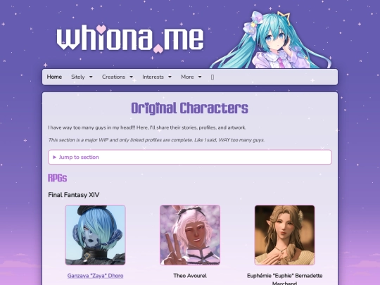
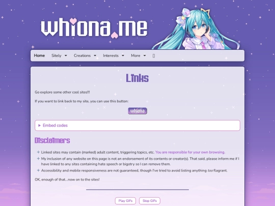
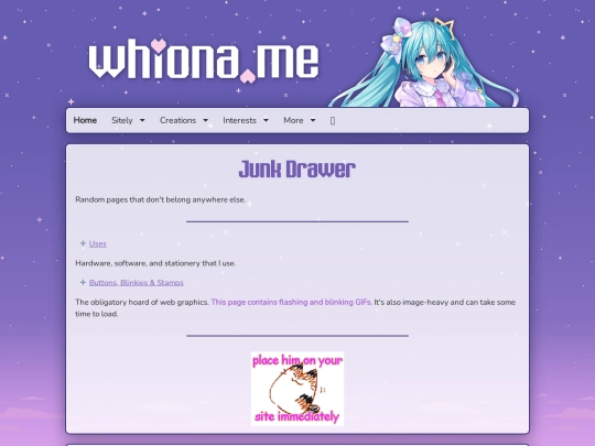
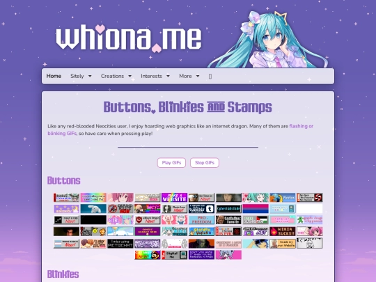


it looks great!!
I'll add you when I get the chance 😊
OOOOH she's so SHINYYY
it looks really good! Added it to my links page :3