well, if you think it's ready to replace the real index page, you may as well go do the thing :)
Overall, I think it's pretty great in form and function. Main bit of criticism I have is with the ground element having width 120% - seeing as it adds all that empty space to the right of the house (and the horizontal scrollbar leading to said empty space). might be worth truncating that so there's no horizontal scrolling into empty space on desktop (and maybe worth truncating the empty space at the very bottom too).
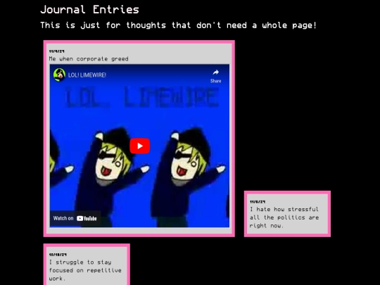
nice. also sidenote - see if it's possible to make the scrollbars on the bulletin board things only show if needed (due to content overflow) rather than always showing (even if vertical/horizontal content doesnt overflow). problem is most obvious with the sticky note things, redundant vertical scrollbar cuts off the single-word content (and makes them look a bit scuffed by making them need to scroll horizontally).
I think I am just gonna keep scrollbar functionality on the notes but hide the scrollbar. You can't even grab onto it with your mouse if the scrollbar doesn't overlap with the corkboard.
It looks awesome so far!! Very impressed!