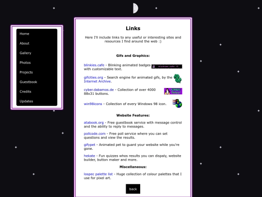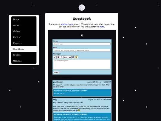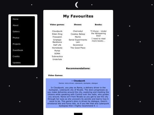
You could use a CSS Hover effect that enlarges the features when one hovers over them, that way you could make them small enough to fit on the width of your page. You might try using CSS Flexbox or CSS Grid to organize them on the page so that they scale to the screen size of the viewer. There are plenty of tutorials onlie and on Youtube, but make sure to find one of the more recent ones, say 2017 - present, as the
old keywords from when they were first being developed don't work anymore. You could also check out an old website called the CSS Zen Garden that has a lot of examples for page layouts to get some ideas. https://csszengarden.com/
Ah, I see you're using some Flexbox but only the center div resizes..and some of the images go out of bounds when it does b/c they don't resize. Ditch the tables and use FB or Grid for everything instead, perhaps, that way the divs can reshuffle to different layouts depending on viewer screen size.
Thankyou for the help arkmsworld :) I'm going to look through the CSS Zen Garden website and see if there's anything I can adapt and yeah get rid of those tables haha
it feels a liiiiittle bland. maybe mess around with colors and borders. but idk that is just my taste.
I see where you're coming from, but I'm happy with the colours and general aesthetic at the moment, it feels right to me for what my site is. I might change it up in the future though
Thank you! I like yours too, but I particularly like the pixel art bird in your gallery :) I have some new recipes to share, so I'll have to update that page soon!
Hey! yeah feel free to email me or ask on discord, you can find both on my homepage :)
It can be found linked in my About page :)