Neocities.org

 pencilvoid
1 year ago
i don't think i made it clear but my website actually isn't supposed to be called pencilvoid.neocities.org. pencilvoid is just my name. i've been trying to think of a name for my website for approximately 3 years
 owlroost
1 year ago
And if you want to use Firefox, consider making use of the Arkenfox project to harden it a bit.
 pinkvampyr
1 year ago
I use librewolf which is like a pre-hardened Firefox. Tor is cool but not really for everyday use imo especially if you're still logging into things, which compromises your anonymous session.
 pencilvoid
1 year ago
couldn't decide how wide to make the main content column so i let you choose for yourself
 owlroost
1 year ago
Love this idea! Might be helpful to add units to the default- right now, it's unclear. 80 what?
 pencilvoid
1 year ago
Good idea. at the time i figured the units wouldn't be that relevant to the end user (also i didn't feel like explaining CSS units)
 pencilvoid
1 year ago
i've never been that good at mixing colours and to be honest there are quite a few pages i think are just plain ugly
 pencilvoid
1 year ago
Also just pushed a fix for the display settings not working right on the art gallery pages
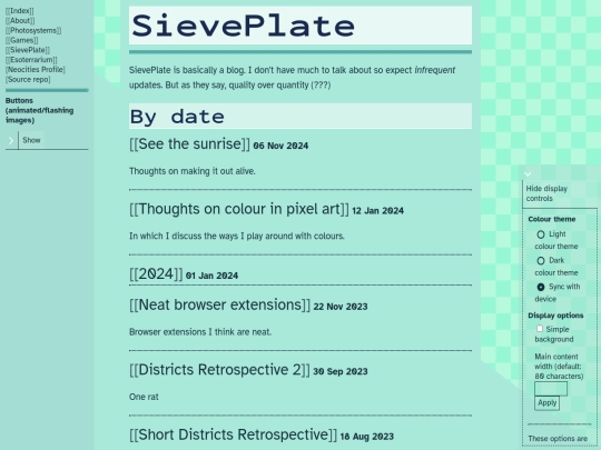
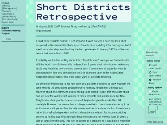
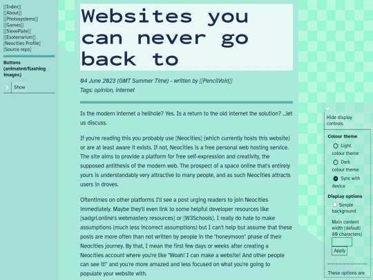
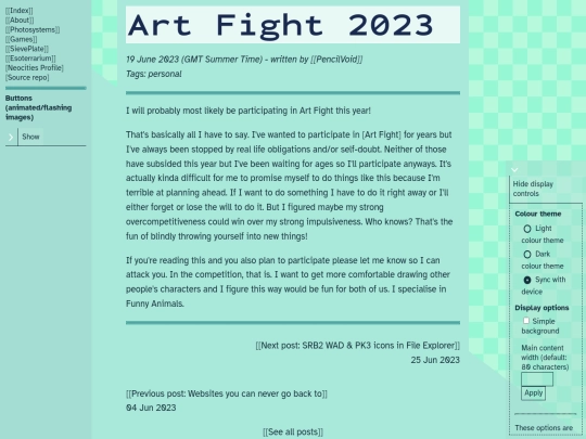
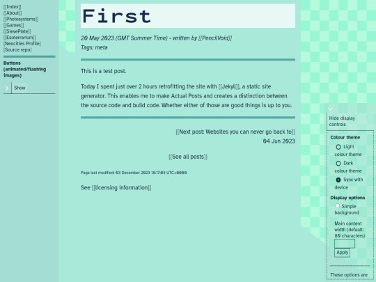
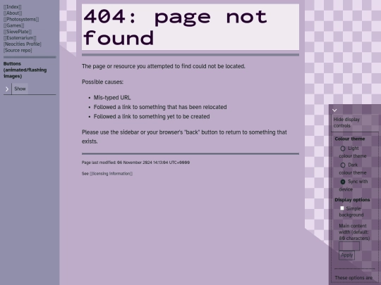


Fixed the option to hide the checkerboard background not working. JS makes it really easy to make typos