Neocities.org

 arandomsite
1 year ago
you could make a custom thumbnail: https://arandomsite.neocities.org/blog/custom-neocities-thumbnail
 owlroost
1 year ago
Default colors (outside of the media query) as dark mode- aka set dark mode default by skipping the check for it. Then place a light mode check changing any relevant colors after that. Should do the trick afaik.
 pencilvoid
1 year ago
that's actually quite similar to how i'm doing it already and it seems to have the same effect as just checking for dark mode. i love css
 pencilvoid
1 year ago
while i was working on them i found out that the fucked up CSS i use to create the checkerboard pattern has been causing the thing on the landing page to appear wrong all this time so that's fun
 owlroost
1 year ago
Shocked that was "wrong", looked intentional. Looks great either way tbh, that's what inspired me to start figuring out CSS animations.
 owlroost
1 year ago
I prefer light mode. It's difficult for me to read text cast against the checkered background- I usually read at the bottom of the page where it's the solid color background. The contrast is great against the solid color. The purple pages are easiest to read. The green/teal ones are so-so on checks but the easiest by far against the solid color- the green on blue makes it pretty easy.
 owlroost
1 year ago
Orange pages are extremely hard to read against the checkered background (lacks contrast w/light orange squares) but fine against the solid color.
 owlroost
1 year ago
Article reader mode works great on pages that have it available, by the way- just checked while I was at it. If I remember right, article reader mode requires article tags and p tags with a certain word or character count to work/show up.
 pencilvoid
1 year ago
thank you for your insight! i've been wanting to add a light mode to the site for a long time but i was struggling to think of a way to go about it, your comment about the checkerboard is actually really helpful
 owlroost
1 year ago
There is a media check for light mode! @media screen and (prefers-color-scheme: light) {} should allow you to set colors for folks set to light mode. I use a dark mode check and CSS variables to set the color scheme for my own site.
 pencilvoid
1 year ago
the media check is a good idea but i might have to combine it with an in-browser toggle because i don't like that "prefers light mode" and "no preference" get lumped together lol
 owlroost
1 year ago
Yeah, always did think that was weird. You can make dark mode the no preference default if you structure things right though.
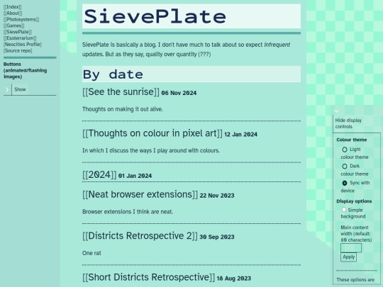
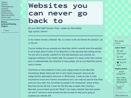
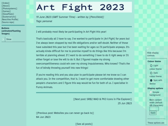
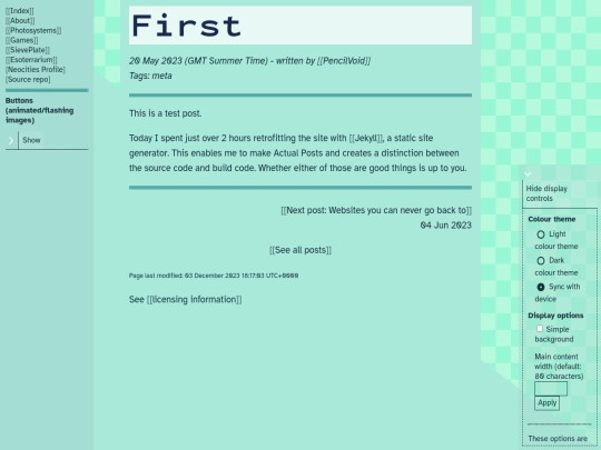
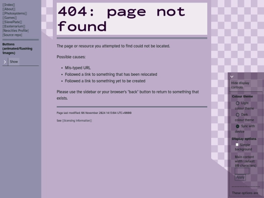
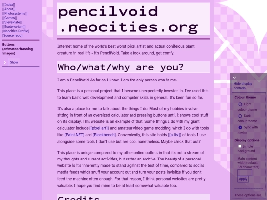


every day i slowly become more and more aware of the fact that eventually i will need to switch to a host that lets me do stuff server-side