Neocities.org

R.V.Klein 🐇 HOME
 rvklein
5 years ago
Don't know why I left out "Ubuntu Mono" from the fixed-pitch font stack before. Also added the wonderful "Agave" font to the stack, since I just discovered it recently.
 rvklein
5 years ago
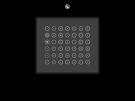
Yeah, I'm testing it right now, but lack the capacity for the build script to make the animations... even though I've done this before. This is probably the third iteration I've made going on the same concept of a circular cursor theme.
 rvklein
5 years ago
The testing version I'm using without the animated progress/wait cursors has stood up well to my scrutiny thus far. I feel like this is a really solid design piece and I'm happy about that. The display page itself I might consider a piece of art.
 rvklein
5 years ago
Otherwise worked fine with secondary/alternate mouse button. So not really a big issue.
 hotlinecafe
5 years ago
Thanks for the feedback @rvklein! I agree those controls aren't particularly intuitive yet, I'm only just getting into touch game development so will hopefully refine this stuff in future. I think Neon Tone is completely broken on touch screens, to be honest with you I only ever designed it with keyboard/mouse in mind at the time. More content to come soon :)
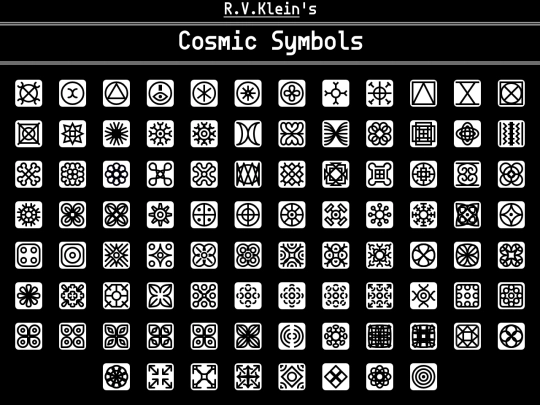
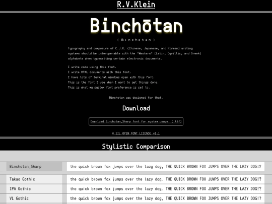


Your layout and templating system is very cute by the way.
Thanks, I try hard to get the system right and add all the placeholders before I make touchups to the entire thing.
I just publish whatever and then try to fix it later if I messed something up (which I almost always do).