Neocities.org

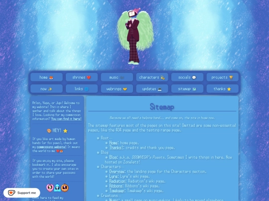
HEY I added a link to my Discord server on the left-hand side bar! If you didn't know I had a Discord you know now!!! Discord jumpscare!!!! Join us!!!
2 likes
Hey I just wanted to share another style update for my professional site. I promise this is the last one for this year. https://doomvega.art/
1 like
Added some new TamaNOTchis to the left sidebar + will write a site update soon-ish when I actually wake up proper
1 like
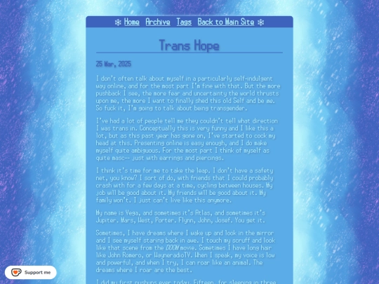
Alright I think that is enough styling for the night. Tag pages are up with no issues. There's a mysterious blank bullet point though. Really have no clue what that's about and I can't seem to remove it lol.
2 likes
Tag pages should be up now. They might be a little bit broken. Do not worry about this. I made a silly error and will fix them
2 likes
2 likes
Forgot to mention it but Zonelets is now up and running on Noctivagant with a tagging system. There are still some bugs to fix (there's a strange blank tag that keeps appearing and I'm not sure what that's about) but for the most part it should be useable. Tag pages will be coming soon!
3 likes
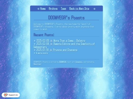
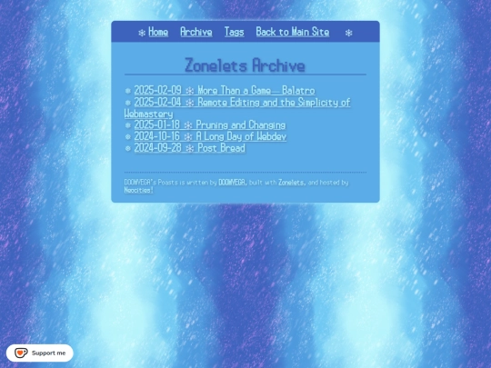




You can viist this page here. https://noctivagant.net/blog/