Neocities.org

capstasher
1,956,288 views
184 followers
3,892 updates
0 tips
I was lookin to see if you had a button to add to my site, I noticed that you added mine, but the link to it is wrong. You wrote 'eduite.neocities.org', it's not, it's 'eplenas' Just letting you know in case that was a mistake. Cool also that you change the color schemes of all the buttons to reddish.
3 likes
 capstasher
2 years ago
oh man, terribly sorry about that! i dont know what i was on when writing that update (probably more of a case of me lacking something (sleep))
1 like
Stuck waiting for container opening tools. Is that the end of the latest episode or am i just overlooking something?
1 like
 corru
2 years ago
that is indeed the end of contiguous content presently! the next episode will start with that 😈
2 likes
 corru
2 years ago
i really gotta figure out a better "in-universe" way to say "you've seen everything buddy come back in a few weeks" 🤔
2 likes
 capstasher
2 years ago
I am very excited to see where the adventure takes me next. You've created something fantastic here
3 likes
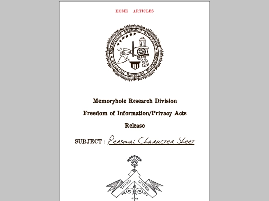


This is probably the most interesting format I've seen an about page in, and the presentation is incredibly appealing. I've never seen the "hate values" test. o_O
dont take this as an about page, it a project which i'll expand on in the coming days. some of the information there is accurate about me, while some is fake. its an example of the personal character sheet for demo purposes
Hmm, interesting concept in that case! I'd just wondered since it was full of axes tests.