Neocities.org

new nostalgia shrine <3 https://cepheus.neocities.org/shrines/freewebs/index.html
4 likes
5 likes
1 like
new content: guestbook themes! https://cepheus.neocities.org/vessel/planets/saturn/index.html
3 likes
5 likes
i wish there was a drag and drop site builder (piczo style) that didn't use templates, maybe even one that you could convert directly to pastable html. that'd be fun
6 likes
1 like
1 like
question: currently set the header of this page to be a minimum of 1920px wide - anyone with a higher display will see the image stretch to fit their screen. is this a good idea or is there an alternative (short of making the image wider)?
2 likes
 rivendell
4 years ago
I think this works fine, though FWIW my screen is narrower than 1920 and I see a horizontal scrollbar. Other options include (1) tiling the image (2) limiting the width of the page content with max-width so any extra screen real estate is just left empty, or (3) doing something cool/weird with the edges of the image, like tiling or stretching just the N pixels closest to the edge.
 cepheus
4 years ago
@rivendell hm i see, thanks! i think i'll leave it as is - horizontal scrollbars i'm fine with for this page i reckon bc i like that it gives the page different parts to explore!
1 like
happy birthday to ME
5 likes
1 like
1 like
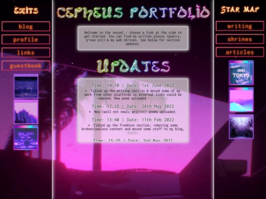
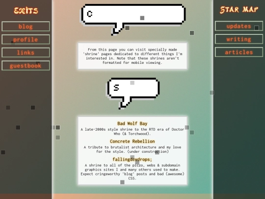


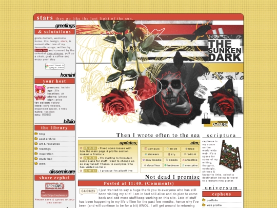
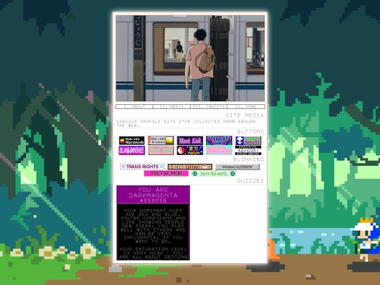
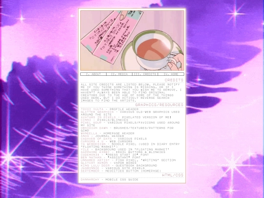
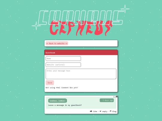

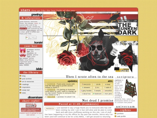
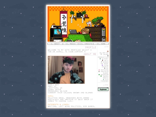

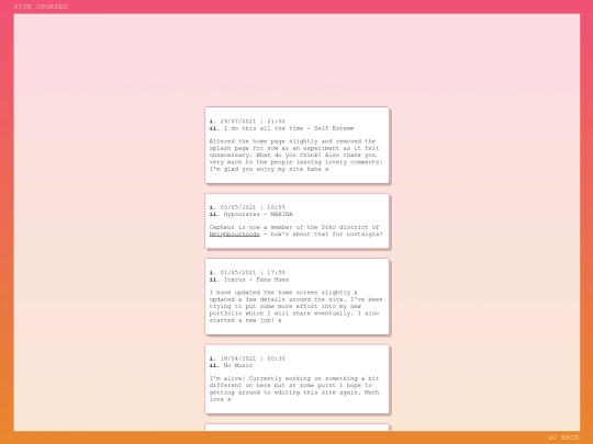


(heavenly inspired by what @avenue is doing, so kudos!)
(heavily*** ffs)
Aw thank you! I’m glad my dumb piczo website love has inspired you :)