Neocities.org

I didn’t forget about finishing the page I was making for your collection - i just don’t have a clue on how to organize my time :| But i will send something I promise
6 likes
 jackomix
5 years ago
if i see you in the alleyway again without my money, i'll get my goons to getcha! jokes aside take your time. :)
5 likes
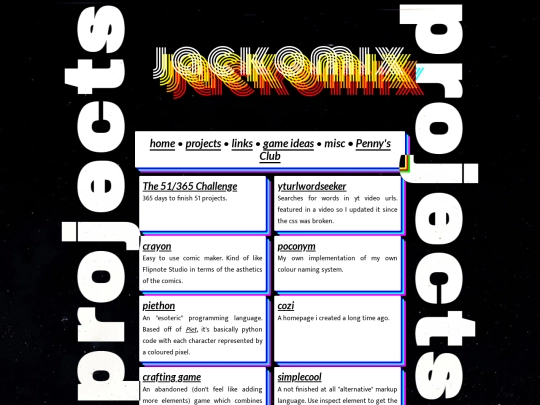
ez bois 70k views next we're gonna get my profile picture on neocities updated to my new background
7 likes
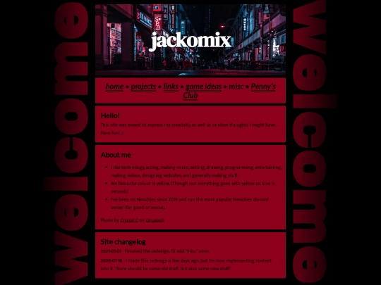
hopefully made the text easier to read. :) (thanks to undoified for reminding me text outline exists lol)
7 likes
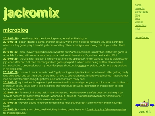
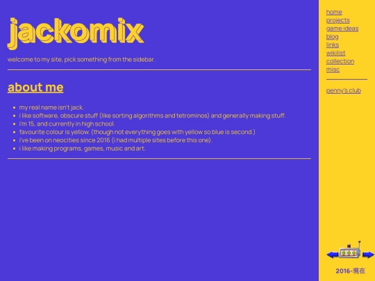
site style update is done bois
7 likes
3 likes
 shrew
5 years ago
It looks good, but you might want to add a white border around the text so its more readable.
4 likes
 voov
5 years ago
I'm gonna be the miserable dissenter; I liked your old one better, cos I liked that colour combo. I'm sure the new one will grow on me - it does remind me of some wrapping paper my mother bought in the 80s :p
8 likes
2 likes
 owlman
5 years ago
I was going to say that you might like to make the transparent boxes a little darker, as the background kind of classes with the text
3 likes
 jackomix
5 years ago
yeah i was slacking inbetween making the style, but it's done (and readable) now. :)
3 likes
1 like
neocities still allows you to make folders with spaces, then freaks out when you try to edit a file since the folder has spaces. :)
8 likes
1 like
3 likes


O RLY?