Neocities.org

3 likes
3 likes
 youtuube
2 years ago
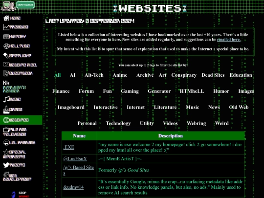
The revamped website list is live! Still need to tweak a few things to make sure the tags sink up/are proper. Huge thanks to explorar.neocities.org for the JavaScript!
2 likes
Is there anyone here who is adamantly against JavaScript? I am revamping the website index to list and categorize everything better using it, but I can keep the old/non JS version around if there is still a preference for it.
1 like
 webpage-1990-colourised
2 years ago
Other than not being a fan of its syntax I don't see a reason to be against JS. I know there is a group here that likes to make low impact websites that try to use as little energy as possible. Other than that I think it's alright and can do some cool stuff.
2 likes
5 likes
1 like
i went on your website and my browser crashed
1 like
1 like
1 like
 youtuube
2 years ago
oof, I'll have to do some more optimizations and see if that can make a noticable difference
2 likes





I'll take that as a compliment lol, thank you