Neocities.org

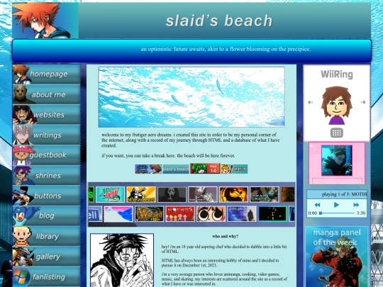
slaid's beach

slaid.neocities.org

73,604 views
226 followers
346 updates
0 tips
i love your directory and everything being so drawn!! its cool as hell
6 likes
dude i love your site!! i like how u personalized everything with characters from stuff u love (like banners or the navigation), and also i joined ur fanlisting like, yesterday :p thx 4 the follow!
6 likes
slaid 5 months ago

OH MAN thank you so much!!! yeah I follow people who sign up for the aero fanlisting ^_^ need to get to accepting again

2 likes
absolutely love the color scheme and mix of general aquatic theming with some frutiger-aero thrown in for this website, giving it a closer look rn
6 likes
slaid 5 months ago

oh wow thank you so much!! appreciate the comments so much ^_^

5 likes
love the site, the dark blue theming is awesome to navigate
3 likes
feelingmachine 5 months ago

yayy ty ^^ dark blue is obviously my favorite color i'm glad other ppl like it too

4 likes
12 likes
slaid 5 months ago

added the library of animanga/video games!! will add to it but just wanted to get it out

2 likes
slaid 5 months ago

the library directory looks a little harsh so i'll rework it eventually...happy with how the buttons look on the page tho

2 likes
working on a library (for the manga i've read) and a gallery for the photoshop works i've done....will probably be my next big pages ^_^
19 likes
cute...adore the art you have all over your site
2 likes
succuguts 5 months ago

thank you so much waaaaa <3

2 likes
in love with this site…your website logo is AWESOME
3 likes
succuguts 5 months ago

Thank you so much! <3

1 like
dustedpink 5 months ago

Thank you so much! I've always been worried that the dither effect might be too much but I've really settled into the look of the logo now! ^^

1 like
holy shit I’m obsessed with the windows longhorn concepts…they’re so ethereal and fluid in the best ways https://youtu.be/WVvtzkpyRTg?si=6aADHYgwDefCXBT-
11 likes
slaid 5 months ago

the login screen is WILD. if only they released that animated wallpaper

7 likes
makoenergy 5 months ago

it’s so glossy and gorgeous OMG!! I’ve seen screen captures of the beta builds but never this

3 likes
slaid 5 months ago

RIGHT it's so good

1 like
graybox 5 months ago

as a commissure of early flat design, i tend to use windows Neptune concepts for inspiration. its quite funny seeing modern design elements in an almost 30 year-old concept OS :P

1 like
does anyone know good alternatives to Fandom/Trello in order to make a wiki? I'm helping a friend make one and don't wanna use either of those two
5 likes
duskspirals 5 months ago

Mediawiki and host with Miraheze! I actually just started my own wiki for my own fictional world. It has a slight learning curve for starting but it honestly isn’t that hard once you start getting into it

5 likes
slaid 5 months ago

ooo very very pretty....i tried miraheze a few days ago but I couldn't figure out how to change background colors and make my pages wider (they only have a narrow middle)...do you have any tips or guides?

2 likes
slaid 5 months ago

WHOOPS while trying to click the link again I accidentally deleted the reply apologies

3 likes
duskspirals 5 months ago

So I dont have any exact guides, but thats the exact issue so heres basically what i did. So firstly you can change the the overall Theme by going into Aditional settings, Styling, Then selecting the theme. You can get more themes by going into extensions and checking off 'skins'. Theres even a theme based off Fandom/Wikia. Writing a second message!

3 likes
duskspirals 5 months ago

Secondly you can edit the colors/css by searching in the searchbar the phrase Mediawiki:Common.Css . Not super intuitive, but here's that on my page https://venturepunk.miraheze.org/wiki/MediaWiki:Common.css . I'm still very much figuring out how to do it, but I'm also very new to coding in general. My CSS is for the Vector theme and you are fully encouraged to just copy/reference anything I put, though im not-

3 likes
duskspirals 5 months ago

-sure how much works on other themes. Hopefully that's somewhat of a start, Im free to answer any questions bahaha

3 likes
slaid 5 months ago

Dusk. You are a literal lifesaver. This answered literally everything I needed. Thank you so damn much.

3 likes
slaid 5 months ago

I will let you know if I have any questions but so far everything just worked perfectly. Thank you again

3 likes
slaid 5 months ago

It's insane how the default is Vector-2022 and apparently every guide is for normal Vector and Vector-2022 is impossible to change background colors for. Why do they do that

2 likes
duskspirals 5 months ago

Exactly how I feel as well. My favorite theme is Monobook but I'm not at the level where I'm able to figure that out yet. Super glad I was able to help! In case i dont see anything here you're always free to drop a message on my page as well :)

2 likes
welcometowelcomehome 5 months ago

you probably already got this resolved, BUT if you want to keep said wiki on neocities, limegreen has a goooorgeous and easily customizable wikitable template right over here: https://limegreen.neocities.org/templates/wikitable/wikitable. sadly i did not know about it while setting up my own wiki :,D BUT i'm hoping it's of use to someone out there lol

1 like

Website Stats

Last updated 1 month ago
CreatedDec 1, 2023
Site Traffic Stats

Tags

aero videogames music personal anime