Neocities.org

Cool site! Like the gum reviews. Did you know there's a gum wrapper museum? https://www.roadsideamerica.com/tip/32154
3 likes
Hey, thanks for the follow! Looking forward to seeing what becomes of the Egyptian page.
3 likes
4 likes
 divergentrays
2 years ago
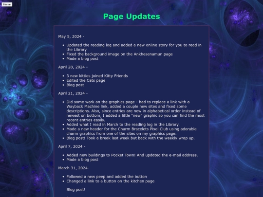
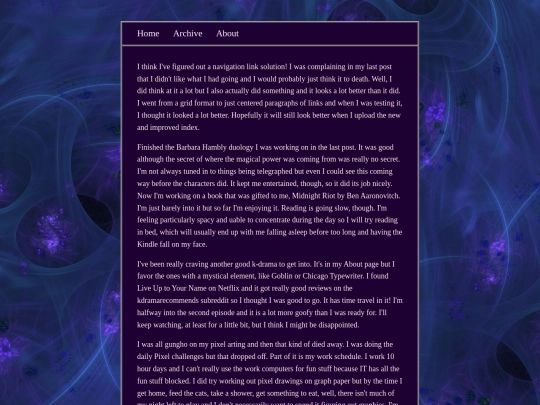
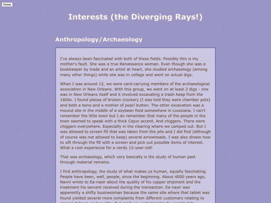
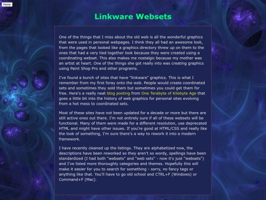
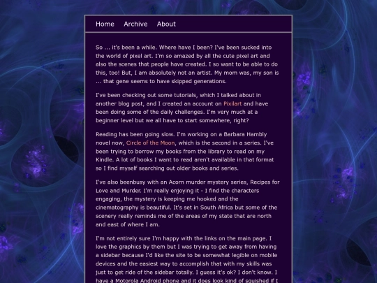
Changed my nav links set up which had been bothering me, tidied up the interests page and added a new section, added some more old graphics sites I found, made a blog post. May have gotten more accomplished but ADD brain wasn't having it.
2 likes
 enflicted
2 years ago
There is just something pleasing about a clean, and centered layout. I like it! Good luck on your pixel art journey, I'm on that same journey, and..well it's not easy lol
1 like
Your blog post about your Portland trip was great! So jealous you got to see an art vending machine in the wild!
1 like
 psshaw
2 years ago
I KNOW, RIGHT... The one I found was with a company called The Venderia. I guess they put them all over Portland!
4 likes
Really like the new layout!
4 likes
2 likes
5 likes
 divergentrays
2 years ago
I simplified the code on all my pages. It's not a sea of divs now! I think the pages will play nicer on mobile now.
2 likes
Love your website! <333 I'm adding your button on my cool sites page!!
2 likes
1 like






thats so rad!! thanks for sharing,, your sites awesome too!!