Neocities.org

I love your pages! I had to giggle at that stunning protrait in your About page, it's beautifully framed, too!
4 likes
Happy new years! It's 3AM and I'm done in for the night, have a good one girls!
14 likes
12 likes
 virtually-isolated
3 months ago
I'm making a more distinct sub site for my personal tabletop stuff! Look for the Roll A D3 button in the top right!
3 likes
I am a fan of this Windows XP WordArt aesthetic, and how much of a trove of projects and information this is! A wonderful little site.
1 like
Your site is so old school and wonderful in it's design, I'm back in 99' again and I love it! Beautiful and cute art gallery, too!
5 likes
 thegreenherring
3 months ago
Thank you! I'll never stop doing code page 437 "ANSI art" and I'm happy to see this aesthetic have the appeal that it does. I look forward to doing more art and making more games as time goes on! Enjoy! :3
2 likes
I love the vibe of your site, but I'm in love with your Pokemon and Digimon pages in particular!
3 likes
2 likes
12 likes
 virtually-isolated
3 months ago
If you send me something, sorry! I fumbled the email. It has a lowerscore between retro and rat! Fixed it on the site itself.
1 like



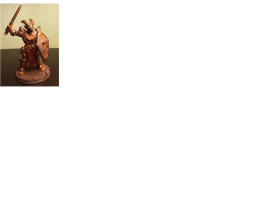





thanks! it's actually a mini I 3D printed and painted and photoshopped onto a photo I took in the Paris catacombs. I really love your site too! the layout is so fun and your art is beautiful, definitely gonna add your button :)
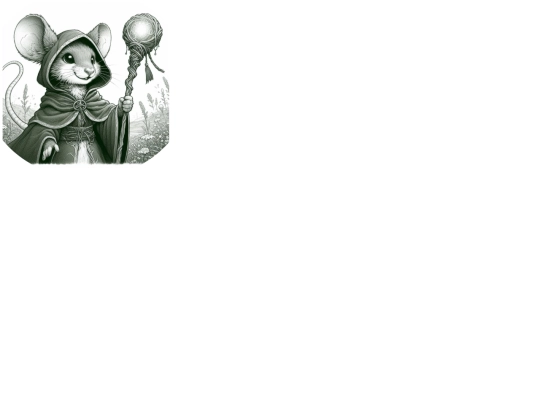
Thank you! Just about all the art is commissioned stuff though! Melipatas did the little icon in the top left and Matcha.EXE made the lovely piece on the About page. Both can be found on Neocities if you wanna see more of their stuff!