Neocities.org

 ziggybeeps
2 years ago
There are pros and cons for either approach, and it depends entirely on the kind of experience you want to provide. Subnavigation allows people to more quickly get to something specific - not sure if that's your intent for the content you have on these pages. Your nav being vertical DOES allows for a lot of categories, so you have the opportunity to surface more if you want to.
 ziggybeeps
2 years ago
So ultimately, do you want people to wander or to browse? (FWIW, I like what you have already, since the navigation is driven less by the buttons themselves and more by the narrative.)
 buzzsawfunds
2 years ago
both are good honestly! im also very indecisive so idk if i can be of much help-- that being said though, i think personally i prefer going down virtual rabbit holes (the way it is now) rather than having all the subpages be visible on the first page., (but there's virtues to including everything on the nav too.....) idrk! i just find it fun to click a lot of links !
If it was a drop down menu you could list the subpages but if it was in addition I think it could get a bit long and laborious to maintain if you have to manually update the navbar on every page each time you want to add something. I removed some subcategories myself because it was getting a bit long. But it's up to you in the end.
 noodledesk
2 years ago
i had the same thought as you and ultimately have decided to keep mine as is and make browsing my site more about wandering...but i'm thinking of maybe putting a bunch of links on just my index so browsing is a little faster!
 plasticdino
2 years ago
Something that night help the load times: make the decoration images smaller. For example, the cool skull banner asset is 526px in height and 1477px in width but on the page it's never displayed that big. If you open an image editor and make them smaller, they might not take so long to load in 👍
 pseudepigraph
2 years ago
@plasticdino Yeah you're right, i've done that to a couple of pictures but when i have time i'll have to actually comb through the site's pictures and shrink 'em down !
 gildedware
2 years ago
Something that helped tremendously with my own site's load times and storage page (I have multiple galleries) was to convert my art into webp!
 dawnvoid
2 years ago
if you haven't already, you can run stuff through Radical Image Optimization Tool (riot) or similar to squeeze them down. Also webp is pretty cool, better than gifs.
 pseudepigraph
2 years ago
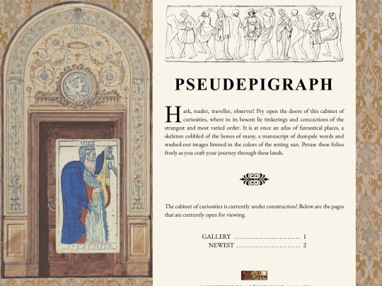
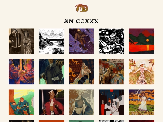
Neocities is having trouble loading stuff at the moment, but if you can see the changes, this is what I meant by yesterday's question. Do you prefer this or how it was before ?
 buzzsawfunds
2 years ago
yeahg neocities was down last night for me too.. its loaded for me now though! i like it!
 buzzsawfunds
2 years ago
i do spot a stray '-->' under your portrait of slava jsyk. besides that tiny thing it looks really neat!!!
 datura
2 years ago
I like it as is but the sorted version might be nice to easily differentiate your original works from fanworks etc
 buzzsawfunds
2 years ago
I agree! I like how it's organized now with the years, but I think having those other categories might be even better


Oh wow, it is SO beautiful!
OUHG I LOVE IT!!!!! the colors!!! the lettering!! <33 putting this into one of those heart locket gifs in my mind
ngl for a second I was was playing spot-the-difference bc the old header was still loaded on my end LOL, but the surpise of seeing the new header after hitting F5 was magical
Your eye for detail is just breathtaking!! <3
it's gorgeous 💛🦎!!