Neocities.org

 pseudepigraph
2 years ago
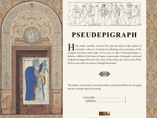
Thank you very much!! The logo was inspired by late-1800s book cover styles (I love those so much, truly) though I'm not the most confident in my lettering skills, so I'm glad you like it !
 capstasher
2 years ago
I see! I love that type of book cover, and i can see you drawing inspiration from it. If you wanted to make it more resemble those book covers you should consider changing the background of the logo to either one of red, blue, green or brown, the most popular cover colours of that time, excluding black.
 capstasher
2 years ago
I made a few mock-ups of how it would look like. You could obviously do it better, as you have both the skill and the files to do it.
 capstasher
2 years ago
https://capstasher.neocities.org/redbanner.png https://capstasher.neocities.org/bluebanner.png https://capstasher.neocities.org/greenbanner.png https://capstasher.neocities.org/brownbanner.png
 pseudepigraph
2 years ago
Wow! My main reference had a red cover, along with the black ink and gilt that I drew from for the banner image. That being said, I think your mockups with the not totally-gold back look great. When I have the energy and time, I'll have to add some detail (and a little more time, too, as this whole site design overhaul, logo included, was kind of done in a one-day frenzy, hah)
 pseudepigraph
2 years ago
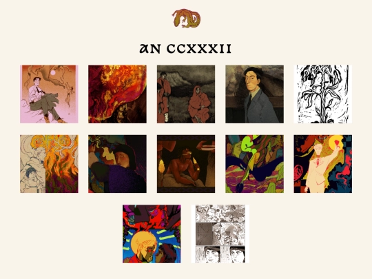
Feels weird putting this up just in the gallery (i was thinking on whether i should add a 'sketches' section) but i told myself i would not divide or rank my own art up based on what i percieved as quality or messy
 pseudepigraph
2 years ago
I feel like doing so, even if it's more difficult, would help with self esteem. Trying to sequester the artworks i perceive as worse away, to be harder to find, is something that will just keep grating at me. In my experience what others perceive as their faves of my work is different than my own opinion. And i want to improve my self image and my perception of my own work! Thus. Gestures to the previous comment
 pseudepigraph
2 years ago
I sure as shit don't share everything I've ever drawn but i want to be fair to anything i have a mind to share. So everything is thrown in the soup, so to speak. Anyways enough of me chatting in these here comments, have a nice day, reader
 atomicgothic
2 years ago
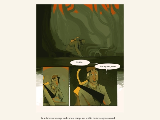
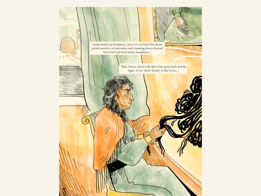
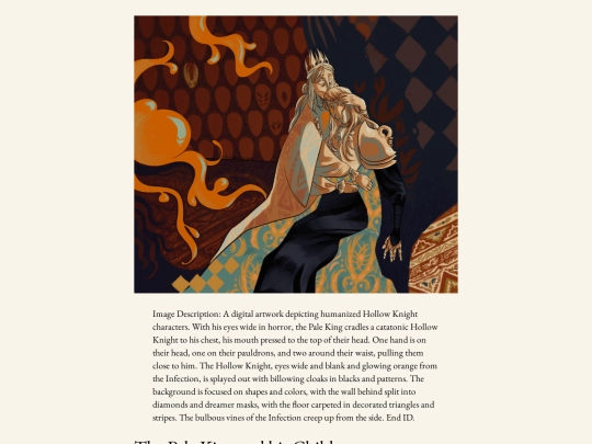
Its so swag how each art piece has its own dedicated image description!!! this laylout is also quite nice






Thank you very much!!! You have a good day too :-)